Ge02
Alicia Kiley
2/12/2018
Welcome to Guided Exercize 2.
The purpose of this exercize was to explore different types of graphs in R. We recreated a scatterplot, a line plot, added color and quartiles, and learned how to plot mutliple lines. For the final graph, we including shading, overlaying two graphs and including a legend.
First we set our working directory, load tidyverse into universe, and read in our data tables into R.
library(tidyverse)## ── Attaching packages ──── tidyverse 1.2.1 ──## ✔ ggplot2 2.2.1 ✔ purrr 0.2.4
## ✔ tibble 1.4.1 ✔ dplyr 0.7.4
## ✔ tidyr 0.7.2 ✔ stringr 1.2.0
## ✔ readr 1.1.1 ✔ forcats 0.2.0## ── Conflicts ─────── tidyverse_conflicts() ──
## ✖ dplyr::filter() masks stats::filter()
## ✖ dplyr::lag() masks stats::lag()player_data <- read.csv("Master.csv")
pitching_data <- read.csv("Pitching.csv")
salary_data <- read.csv("Salaries.csv")
inflation_index <- read.csv("inflation.csv")For the first exercize, we make a boxplot about ERAs for pitchers over a set of years. We start by converting yearID into a factor class before making our plot.
pitching_data$yearID <- as.factor(pitching_data$yearID)
ggplot(pitching_data)+geom_boxplot(aes(x=yearID, y=ERA))
## Warning: Removed 90 rows containing non-finite values (stat_boxplot).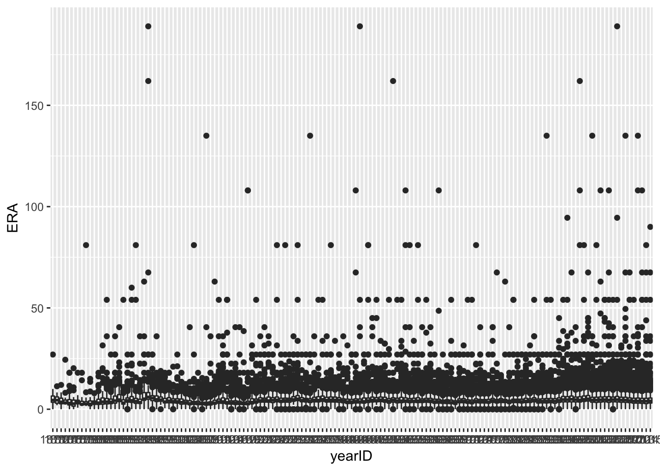
We then turn our ERA boxplot graph into a line plot by taking a summary of the pitching data group, finding the quartiles, median, minimum, and maximum and producing our graph from there.
We also need to reconvert yearID into a numeric factor so that we will have the years along the bottom of our graph.
summary_pitching <- summarize(group_by(pitching_data, yearID), Q1 = quantile(ERA, .25, na.rm = T),
                            median = median(ERA, na.rm = T), Q3 = quantile(ERA,.75,na.rm = T),
                            min = min (ERA, na.rm = T), max = max(ERA, na.rm = T))
summary_pitching$yearID <- as.numeric(as.character(summary_pitching$yearID))
ggplot(summary_pitching)+geom_line(aes(x=yearID, y=median))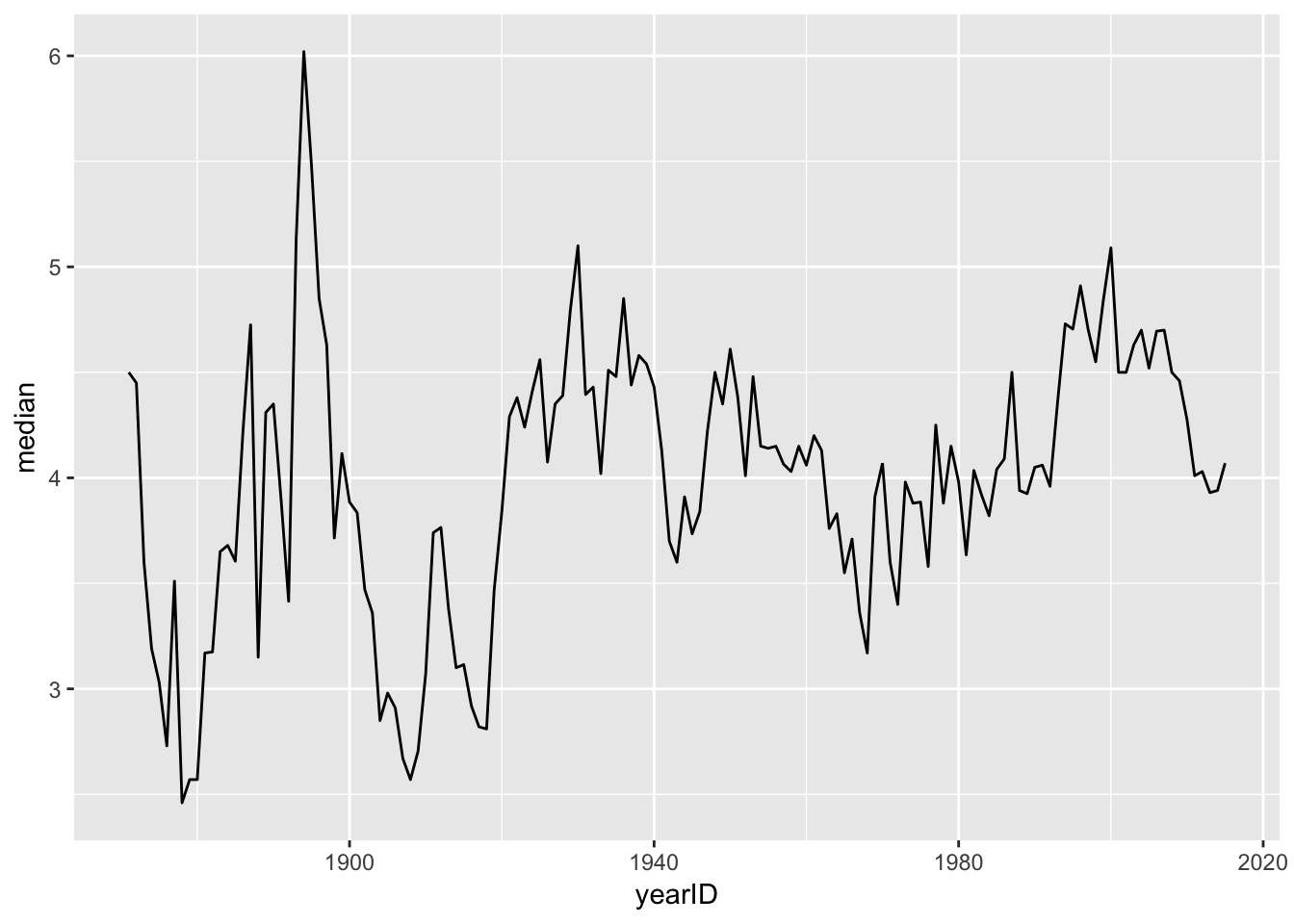
We use the Q1s and Q3s of each year to create a ribbon of the middle 50% of the data, with a line plotting the median of the salaries for each year.
ggplot(summary_pitching) + geom_ribbon(aes(x=yearID, ymin=Q1, ymax= Q3), fill= "lightgreen") + geom_line(aes(x=yearID, y=median), color = "darkblue")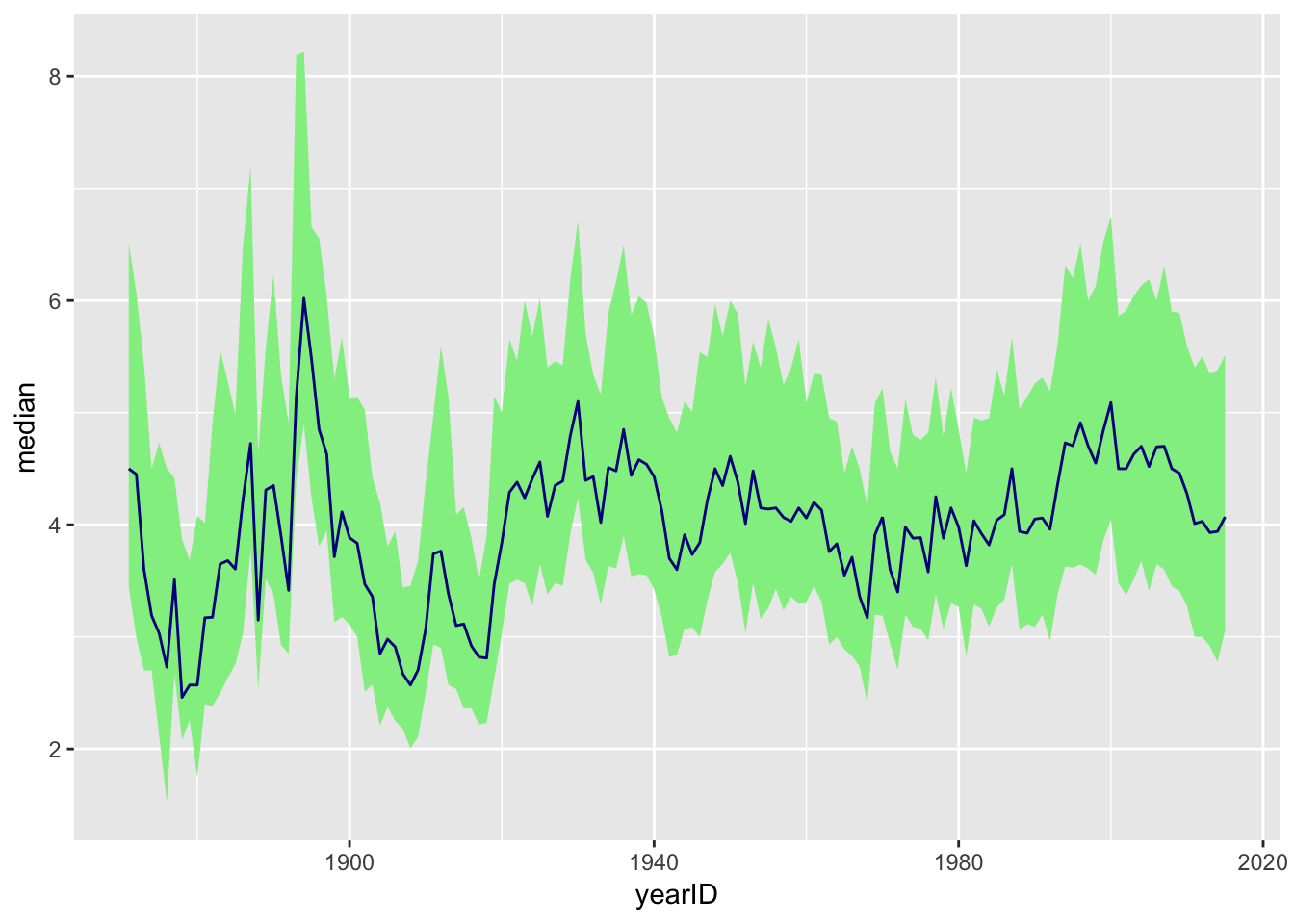
For this graph, we start by subsetting the data to only include pitchers that have pitched 10 or more games. We then summarize the data to tell us the proportion of pitchers who have ERAs less than 3 and greater than 6.
pitching_data$ERA <- as.numeric(pitching_data$ERA)
pitching_data$G <- as.numeric(pitching_data$G)
pitching_10games <- subset(pitching_data, G >= 10)
summary_pitching_2 <- summarize(group_by(pitching_10games, yearID), era_proportion_less =mean(ERA <= 3), era_proportion_great=mean(ERA >=6))


summary_pitching_2$yearID <- as.numeric(as.character(summary_pitching_2$yearID))
ggplot(summary_pitching_2) + geom_line(aes(x=yearID, y=era_proportion_less, color = "3 or under")) + geom_line(aes(x=yearID, y= era_proportion_great, color = "6 or higher")) + scale_color_manual(name = "ERA", values = c("3 or under" = "darkblue", "6 or higher"= "red")) + theme_classic() + labs(x = "Year", y = "Proportion", title = "Proportion of Pitchers (pitching at least 10 games) \n With Low and High ERAs by Year")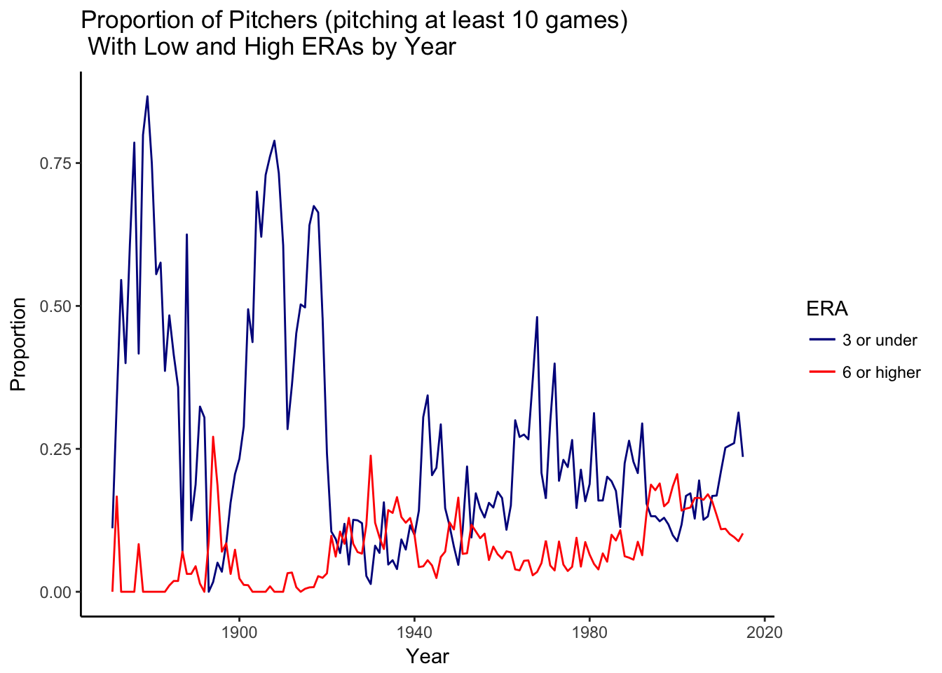
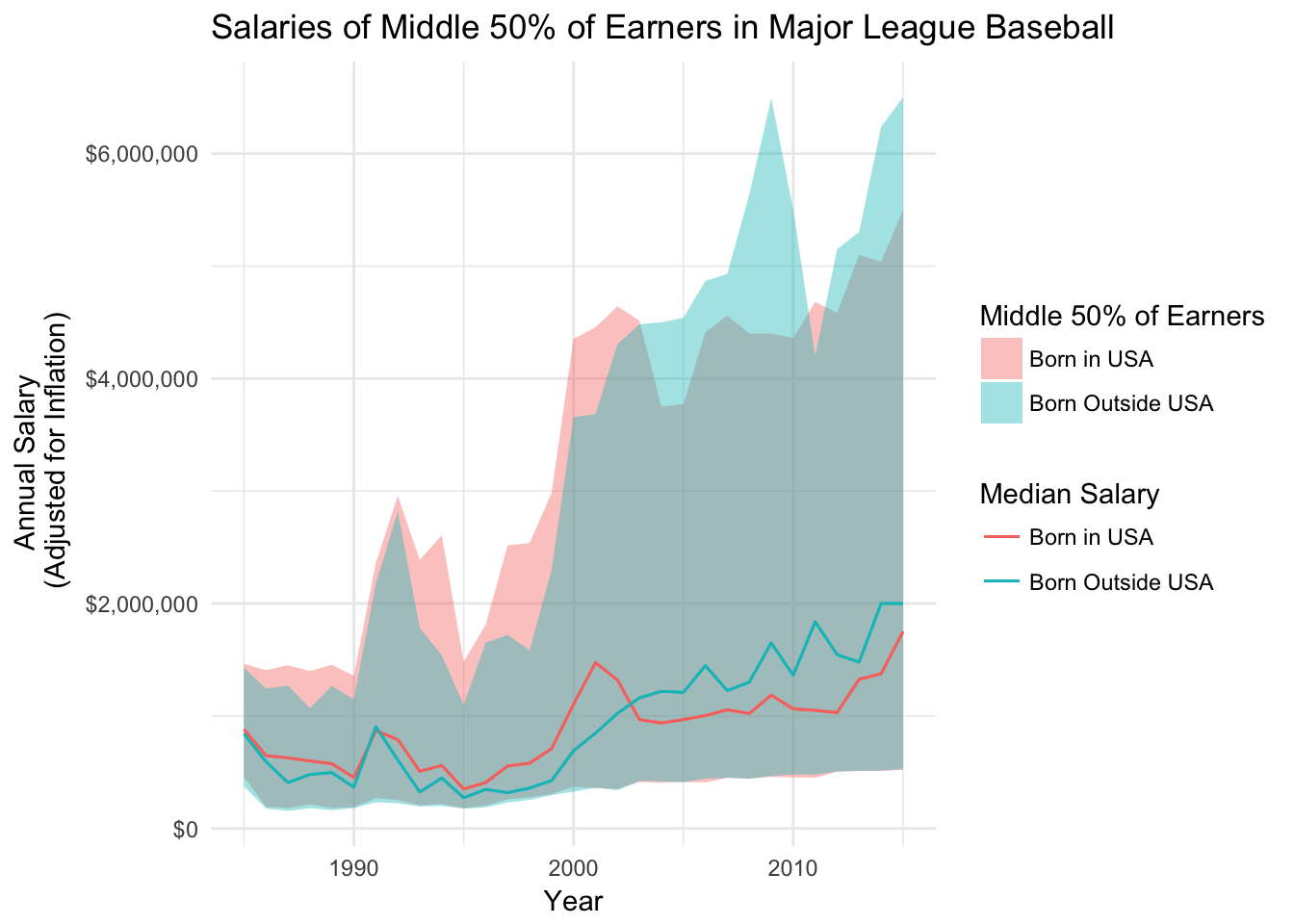
In the final exercize, we looked at how the middle 50% of salaries differ bewteen US born players and non US born players. We first turned playerID into a character factor in order for us to join player_data and salary_data. We also included the new variable of us_born to help us sort the players.
After joining them, we took a summary of our data to find the quartiles, medians, minimums, and maximums, joined this information with the inflation index, and produced our graph from there. My only error was I could not figure out how to hide the alpha value from the legend.
player_data$playerID <- as.character(player_data$playerID)
salary_data$playerID <- as.character(salary_data$playerID)
country_data <- inner_join(salary_data, player_data, by ="playerID")
country_data <- mutate(country_data, us_born = ifelse(birthCountry == "USA", "Born in USA", "Born Outside USA"))

summary_country_data <- summarize(group_by(country_data, yearID, us_born), Q1 = quantile(salary, .25, na.rm = T), median = median(salary, na.rm = T), Q3 = quantile(salary,.75,na.rm = T),min = min (salary, na.rm = T), max = max(salary, na.rm = T))


names(inflation_index)[1] <- "yearID"

summary_salary_left <- left_join(summary_country_data, inflation_index, by="yearID")

summary_salary_left[summary_salary_left$yearID == 2015, "inflation2015"] <- 1


summary_country_data <-mutate(summary_salary_left, median_inflation_adjusted = median*inflation2015, Q1_inflation_adjusted = Q1*inflation2015, Q3_inflation_adjusted = Q3*inflation2015, min_inflation_adjusted = min*inflation2015, max_inflation_adjusted = max*inflation2015)

ggplot(summary_country_data)+ geom_ribbon(aes(x=yearID, ymin=Q1_inflation_adjusted, ymax=Q3_inflation_adjusted,fill= us_born), alpha = .4)+ geom_line(aes(x=yearID, y=median_inflation_adjusted, color=us_born))+ geom_line(aes(x=yearID, y=median_inflation_adjusted, color= us_born)) + scale_y_continuous(labels = scales::dollar)+ labs(y="Annual Salary  \n (Adjusted for Inflation)",x="Year",title="Salaries of Middle 50% of Earners in Major League Baseball")+ scale_fill_discrete(name="Middle 50% of Earners") + scale_color_discrete(name="Median Salary") + theme_minimal()